Making Figures

Make a rough draft figure and iterate
After collecting and analyzing your data you will need to find an elegant, visually pleasing, and easily understandable way to present your findings to others. Make sure that you have all of the pieces of data that you need to construct a figure (mean values, standard deviations, relationships, functions, data labels, etc). Every feature of your figure should be meaningful (colors, symbols, etc) and each one should mean only one thing (i.e don’t change colors and symbols for two different runs of the same experiment). You want to condense as much information as possible into as little space as possible while keeping it all easy to understand. Look at papers that have similar data to what you are trying to make and take notes about how they are made. Make some rough drafts of your figure and show it to others to see if they can easily understand it and incorporate their feedback. All of the following sections are important to incorporate in all drafts of your figures, but don’t spend too much time polishing them until you have the form complete.
Available software
There are a lot of different software to choose from for making figures. Some are easy to use with a simple graphical user interface (GUI), some have complicated user interfaces, and others are command line style tools. You should try as many as you can and choose what fits your workflow best. You will likely change what you use over time. Some easy ones to use are Excel and Graphpad Prism, which can be controlled entirely through a GUI and have built in data processing and figure making functions. Adobe Photoshop, Illustrator, Corel Draw, and Inkscape are graphic design programs that are helpful when editing already made figures and making them look more visually appealing, but have no native data processing capabilities. Matlab, python, R, STATA, SASS, and a variety of computer languages can be used to process data and create figures, though they will typically not look as polished. Many people use a combination of these programs to analyze data and create and edit figures to get them into their final form.
Journal Guidelines
If you know what journal that you will eventually submit to, you can look at the formatting guidelines for figures on the journals website. An example is here: https://www.nature.com/nature/for-authors/formatting-guide. Some journals require specific resolutions, file types, font sizes, or color schemes while others are more lenient and require that they be legible. You should read through the guidelines in their entirety before polishing a figure so that you know what you are supposed to be doing.
Labels and Legends
Your figures should stand alone and not require reading the text to understand. Consequently, everything needs to be labelled. Your axis should have labels for each value as well as for the axis as a whole and any important features should be highlighted or circled. All fonts should be large enough to be read either for a manuscript (see journal guidelines for suggestions) or for a presentation. The font sizes will likely be different for the two media, so avoid dropping manuscript figures directly into presentations. If you have two experimental conditions or an experiment and a fit you should make it clear which parts of the figure goes with each. Legends are helpful for conveying this information without cluttering the figure space. Put all of the information in a small table away from the important parts of the figure so readers can reference it quickly.
Colors
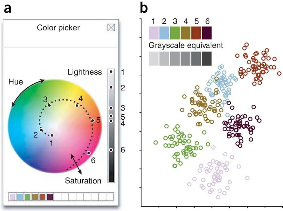
Colors are rendered differently on computer screens, paper, and projector screens so check how they look on the relevant medium before presenting or submitting. You should choose complimentary colors that create a nice palette instead of relying on built in color schemes which tend to make the colors as different as possible. There are many online tools to help you choose color palettes. One example is shown below.
Colors can be tuned using a color picker (a). Spiraling through hue and saturation while varying lightness can generate a discernible color set distinguishable even in grayscale (points labeled 1–6).
Some readers will print your manuscript out in grayscale so it is important to choose colors which can still be differentiated in black and white. See the examples below.
Captions
The figure caption explains what all of the symbols, highlighted sections, colors, and axis mean. It serves as a guide to read all of the data in the figure, but does not include how to interpret the data. Your captions should be as brief as possible while still describing all of the parts of your figure. It starts with a sentence (or often a fragment) that describes what the figure says (ex: Number of virus diagnoses over time in southeast Asia 1920-1978) then breaks the figure into parts if appropriate (part a, part b, etc) and describes each part.


